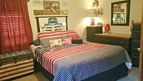
It's the reveal of the One Room Challenge! Here we are. The final touches of the room are done!
It almost didn't even though I was moving ahead on week 4. Why?
Sunday night I brought home lockers for this room. Lockers that I originally wished for at this start of this challenge but didn't find them until now! Now! The final week! Lockers that I completely cleaned, painted, restored, decoupaged and prepared to be moved upstairs on Monday night. Lockers to replace the dresser and both sets of chest of drawers that I also moved out on Monday. Lockers I worked on from 8:30 in the morning until 7:30 that night. In the sun. Where we went from winter to a week of spring to now totally summer weather. Where I sport a sunburn and lost four pounds. (Really, I did. For once, I'm not joking!)
But being authentic, full sized and heavy lockers... we barely got them in the house. We. The team of me and my husband. We sweated bullets at 8:30 p.m. on Monday. Yes this week.
They didn't fit going up the stairs. Even after we ripped out stair railings. So now they sit. In our dining room. Waiting. Waiting for us to take them apart and bring them up to reassemble them when we have time. So it was back to plan "A". I moved the dresser and chests of drawers back in on Tuesday. Tuesday; ... too close to the final reveal today. So let's go back to that other plan.
The goal was to streamline and update this tween bedroom while maintaining all of his interests.
All on a very tight budget.
The room was previously two, and by busting out a wall to make it larger, (well, making the smaller one into a closet and storage area), the main bedroom remained a 9' by 11' space. Small, but it flowed better with the opening.
A mix of furniture against the walls held the 11 year old's clutter. He had and still does... a LOT of stuff! Everything needed sorting and organizing.
By painting the wall a light gray, the subtle change accommodated the new room with contrasting red, white, blue, and black accent colors. This color palette, while maintaining wood trim for future years. (I'm not stripping paint for what I have planned here later. Not those louvered doors anyway!)
It was evident that a media center was necessary along with a study/desk area to maintain activities on one side of the little room.
(And, the bad tape job on the ceiling from the previous home ownership left me in a tizzy of repairing the seams with joint compound before painting. The unexpected but inevitable.)
 |
| Clutter. Mixed storage units with a night stand in the corner. Dogs everywhere. Music, sports, games, movies... all a mess! |
The previous wall shelving remains while it holds the most loved dog collection (now all together and on a much better display than previously scattered around the room.)
And the sports memorabilia are looking much neater. Spiderman, Woody and GI Joe are put away.
With repurposed wood, plenty of desk top space was created on two cubbie units without protruding into the room.
A repurposed tractor seat stool functions nicely at the desk, yet can be used for moving to the window to look at the stars and the moon.
Using spray paint on repurposed desk accessories add the tween's favorite color of red into the area.
By stacking and anchoring the previously mixed storage units with more repurposed wood, the media center holds movies, gaming and music. The pieces were sanded, painted, decoupaged and new hardware was added to update and get all "matchy" like.
A curbside rescue became a "Star Spangled Banner Trunk" to hold extra blankets and treasured stuffed animals. Themed by our National Anthem. I put the words on the front of the trunk. Inside are decoupaged maps.
Leaving much distress to the trunk, just as the Flag endured during the war, the rippled wood appears as waves in the flag on the lid.
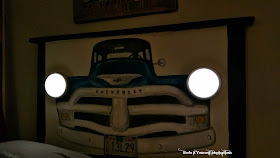
The old headboard got a makeover with a 50's truck in pop art style and push on/off light up headlights.
A license plate collection and repurposed wood art created a gallery above the headboard.
This gallery technique makes the short wall height appear taller.
Pillow covers were made to coordinate with the room.
The headboard is a hit with the tween. He loves it!
A nightlight at the push of the finger tips while in bed wasn't cool; he said... "It's better than cool! It's awesome!"
The four pieces of old wooden furniture got a makeover with Country Chic Paint in "Liquorice", clear wax and new hardware for a masculine look. Perfect for a tween to grow with.
The four pieces are now actually three. I took the two night stands and modified them into a mini chest of drawers shown on the left side of this photo. Balancing out the pieces on the one 9 foot wall to function while maintaining a nice appearance was the goal. (Remember this is a tiny 9 by 11 foot room) The arrangement makes the wall appear wider.
Putting the furniture together in this manner tidied up the wall and defined the area. It appears boring compared to the action packed side of the room. But it works. It's the basic needs side.
Funny, it reminds me of a galley kitchen. By the way, this is where the lockers were going to be with the trunk. (sigh) Maybe a new post later.
The lamp turned Route 66 makeover is accompanied by two vintage hubcaps over the modified chest of drawers. The Packard and DeSoto caps are a LOT older than me. Just sayin'.
We brought home a butterfly curious puppy. But I removed the butterfly and added a baseball. The puppy is now looking to play ball. Much more fitting for the room.
The plane propeller rack doesn't hang out with toy guitars anymore. It became a functional rack with wall art above it to contain yet another interest.
The remote controlled moon night light moved to the window in the closet area of the extended part of the room.
That is, next to the window with the telescope and the globe that we didn't have room for on the desk. Creating a mini universe, the space is another interest in a designated area without intruding on the other areas.
Removing the globe stand and hanging earth from the ceiling, it now revolves with the moon.
A vintage metal tray frames an educational solar system for reference while gazing into the sky.
The window sill is accompanied by "moon rocks". Plastic creatures that glow in the dark.
Another spark for the imagination.
So... how did this come all together? Let's take a look at the before and after.
The organized activity wall
The sleeping area
The extended room with wall to wall closet storage
Can you believe this is a queen sized bed in a tiny room?
Placing the bed in the center freed up space for more walls. And it's an easier method for making the bed.
The two rooms as one. Best solution for more space.
Even though, not a weight bearing wall, we didn't take chances. Maintaining the archway of framework for the roof and frame support was a safety sake. It also serves as a gateway to the storage and clothing closets.
Streamlined and functional.
This wee little bedroom has been made to look spacious, maintain order, and function while keeping hobbies and interests within it.
Because this room involved so many projects, I'll follow up on each with a how to post as soon as I can catch up. The projects have a gazillion pictures to go through and post. I'll be linking them up here or you can subscribe for new post updates. By repurposing most of the room, a chunk of change was saved. I'm happy to show you how.
In the meantime, this room is done. A huge thank you goes to Linda at Calling it Home for hosting this wonderful event. Without this challenge, the motivation to stay focused and finish this room would not have been possible!
Let's check out all of the hard work and the wonderful reveals of the other participants!
One Room Challenge™ Linking Event, Spring 2015, Week 6
~~~~~~~~~~~~~~~~~~~~~~


No comments:
Post a Comment